
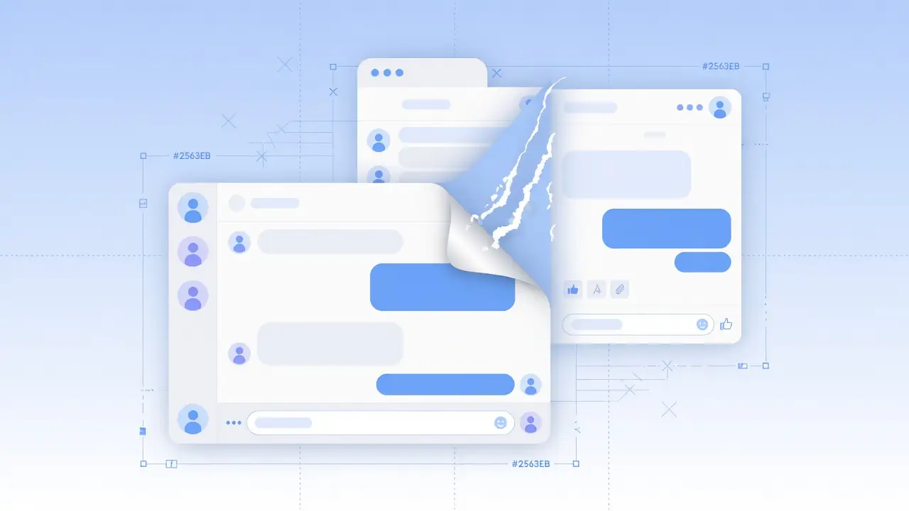
When the world's most-used AI app admits its own interface is confusing, every brand building a digital product should be taking notes.
The ChatGPT app redesign making headlines this week isn't just an OpenAI story, it's a UX case study every brand should read closely. In a recent interview, OpenAI president Greg Brockman openly acknowledged that the ChatGPT desktop app had become cluttered and confusing after months of rapid feature additions, and promised a cleaner, tab-free version by year's end. For a product used by hundreds of millions of people weekly, that's a remarkable admission, and a useful mirror for any founder, CMO, or design lead shipping features faster than they're auditing the experience around them.
This matters because ChatGPT didn't fail on capability. It failed on clarity. And clarity, not feature count, is what actually keeps users coming back.
Short Stereo works with brands across design, motion, and product experience, and one pattern shows up again and again: teams ship powerful features into interfaces that were never redesigned to hold them. The ChatGPT story is that pattern playing out at global scale, which makes it a genuinely useful lesson, not just news.
OpenAI Just Admitted Its Own App Is “a Mess”, Here's Why That Matters
When leadership at the company behind the most visible AI product in the world calls its own UI messy, the signal is bigger than one app update. It validates what UX teams have argued for years: velocity without design review is not innovation, it's deferred cleanup with brand risk attached.
Users didn't abandon ChatGPT because the models got weaker. They got lost inside tabs, modes, and surfaces that accumulated faster than the information architecture could absorb them. That is design debt in public, and brands of every size should treat it as a free audit checklist.
What Actually Went Wrong With the ChatGPT App
Feature Stacking Without a UX Plan
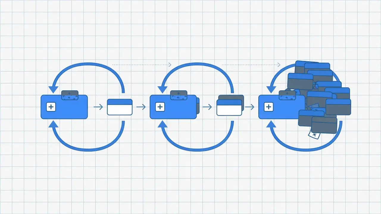
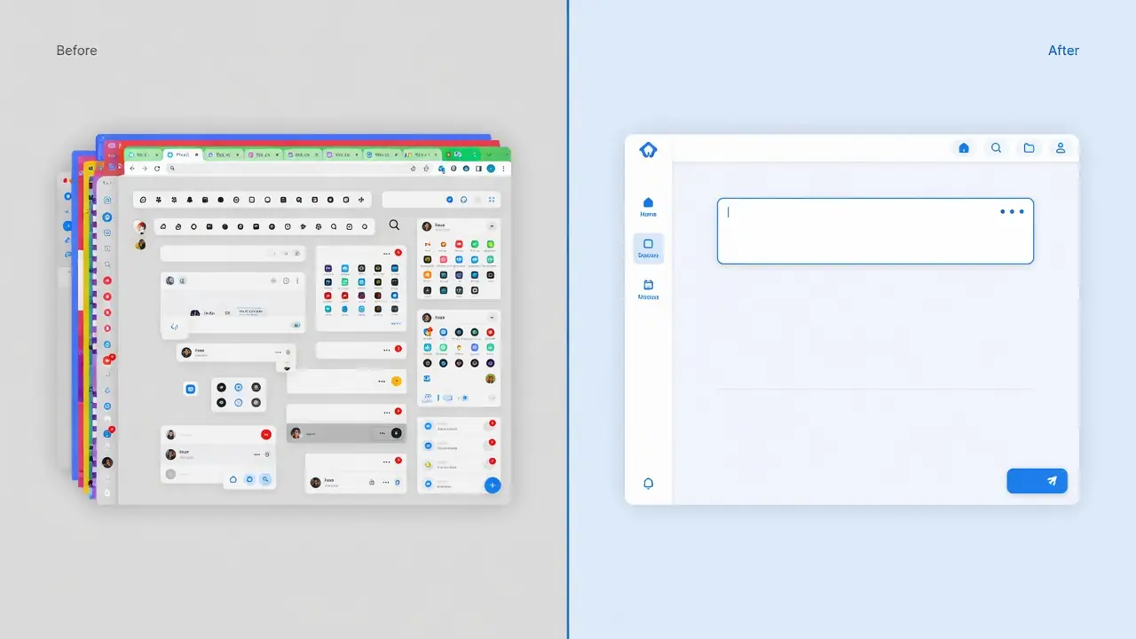
Following the integration of new agentic modes and updated models, the ChatGPT desktop app accumulated separate tabs and modes faster than its interface was designed to organize them. Each addition made sense in isolation. Together, they created a layout that even OpenAI's own leadership called messy.
Tabs Nobody Asked For
Users reportedly struggled to find basic things like their own chat history inside the new tab structure, a sign that the information architecture, not the feature set, had become the real product weakness.
This is the core lesson: capability and usability are two different design problems, and solving one does not automatically solve the other.
7 UX Lessons Brands Can Steal From ChatGPT's Redesign
1. Ship Fast, But Audit Faster
Rapid iteration is fine. Rapid iteration without a recurring UX audit cadence is how “a mess” happens. Build a lightweight review checkpoint into every release cycle, not just major versions.
2. Every New Feature Needs a Home, Not Just a Slot
A new tab is not information architecture. Before adding a feature to your app or site, map where it actually belongs in the user's mental model, not just where it's easiest to place in the codebase. This is core to user-centric design services and solid AI app UX design.
3. Users Notice Clutter Before They Notice Capability
Even the most powerful product loses trust the moment a user feels lost. Perceived simplicity is often a stronger driver of retention than raw feature count.
4. A Redesign Announcement Is a Trust Move
OpenAI's public acknowledgment was, in its own way, good brand management, it signaled that leadership was listening. Brands that own their design missteps publicly tend to retain more goodwill than those that stay silent.
5. Simplicity Is a Design Decision, Not a Default
Interfaces don't get simpler by accident as they grow, they get simpler when someone actively decides to remove things. Simplicity has to be designed for, on purpose, at every release. That applies as much to brand experience design and design branding as it does to pure UI chrome.
6. Mobile and Desktop Users Forgive Different Things
A cluttered desktop tab bar and a cluttered mobile nav fail differently. Any redesign, including your own, needs separate UX passes for each surface, not one layout stretched across both.
7. Your Roadmap and Your Design System Must Move Together
The moment your product roadmap moves faster than your design system can absorb, you're building toward the same “mess” ChatGPT is now walking back. Keep design and product roadmaps on the same cadence, whether you're shipping AI app development, marketing sites, or hybrid product experiences.
If your product experience needs a clearer home for features, not just more of them, start with our website design services.
What This Means for Your Brand's Experience Design
For founders and design leads, the ChatGPT app redesign is a preview of a decision every growing product eventually faces: keep adding, or pause and simplify. The businesses that get ahead of it, auditing their app or website UX proactively, rather than after users complain, protect their brand experience and their retention numbers at the same time. This is true whether you're running a SaaS product, an e-commerce app, or a marketing website: the underlying UX design and user-centric design principles are the same.
The same clarity standard applies to how brands show up in feeds and growth loops. Pair product UX with coherent social media systems and AI content and growth so the experience stays consistent from first click to return visit.
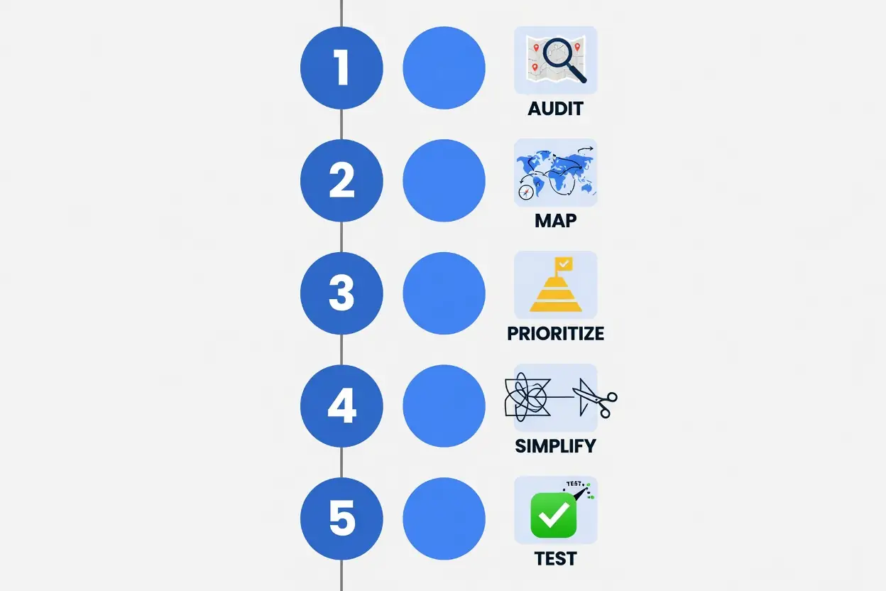
A Quick Playbook: Auditing Your App's UX This Week
- Audit, List every feature shipped in the last two release cycles and where it currently lives in your navigation.
- Map, Sketch how a new user would actually expect to find each of those features.
- Prioritize, Flag the 2, 3 spots where real users are getting confused, based on support tickets or session recordings.
- Simplify, Consolidate overlapping tabs, menus, or modes into one clear path.
- Test, Run the simplified flow past five real users before shipping.
Conclusion: Fix the UX Before Your Users Say It for You
The ChatGPT app redesign is a reminder that even the most successful AI products aren't immune to design debt, and that admitting it publicly can be part of good brand management. For brands building apps, websites, or AI-powered tools, the takeaway isn't to slow down feature development; it's to make UX auditing a permanent part of the roadmap, not an afterthought. If your product's navigation has grown more complicated than your users' patience, it's worth reviewing before they say it for you. Short Stereo helps brands redesign product and web experiences around real user behavior, explore our website design services or visit shortstereo.com to talk through your next redesign.
Source note
For original coverage of OpenAI leadership comments on the ChatGPT desktop app interface (July 2026), see reporting via Android Headlines and related tech press (attribution only; no quoted text reproduced).
How Short Stereo Helps Brands Apply This
At Short Stereo, we turn insights like these into design systems, digital experiences, and content workflows that stay on-brand, so strategy does not stop at the article.
Frequently Asked Questions
Why did OpenAI redesign the ChatGPT app?
OpenAI's leadership acknowledged that recent feature additions had made the desktop app's interface cluttered and confusing, and committed to a simplified, tab-free layout later this year.
What is "design debt" in UX?
Design debt is the accumulated cost of interface decisions made quickly to ship features, which eventually require a larger redesign effort to fix, much like technical debt in code.
How often should a brand audit its app UX?
A lightweight audit every release cycle, and a deeper structural review every two to three quarters, catches most design debt before it compounds.
Does a messy UI actually hurt a brand?
Yes, user confusion directly affects retention, support costs, and word-of-mouth trust, regardless of how powerful the underlying product is.