When Apple iPhone 18 Pro spikes in Google Trends, most coverage chases specs and launch rumors. Brand leaders should ask a sharper question: what does Pro-tier clarity teach about branding, experience design, and the decisions customers make on websites and social feeds?
Search interest around Apple iPhone 18 Pro, related Pro Max comparisons, and upgrade questions shows how people shop: they want to know what Pro means, how generations differ, and whether upgrading is worth it. Teams that treat those questions as design problems, spanning product naming, website UX, social creative, and short video, usually communicate faster than teams that only publish feature lists. This playbook stays faithful to that search demand without inventing sales figures or promising results.
Why Apple iPhone 18 Pro Matters for Brand Teams
Apple iPhone 18 Pro is a high-search product moment. Related queries about Pro, Pro Max, prior generations, and upgrade programs reveal the real job to be done: help people place themselves in a hierarchy. That is branding work. It is also experience design work, because the website, ads, packaging cues, and social posts must tell one coherent story.
For non-Apple businesses, the useful move is not imitation of Apple's industrial design. It is translating Pro-tier clarity into your own offer language, visual system, and post-click path. When strangers understand the premium promise in five seconds, launch attention becomes easier to convert into considered interest.
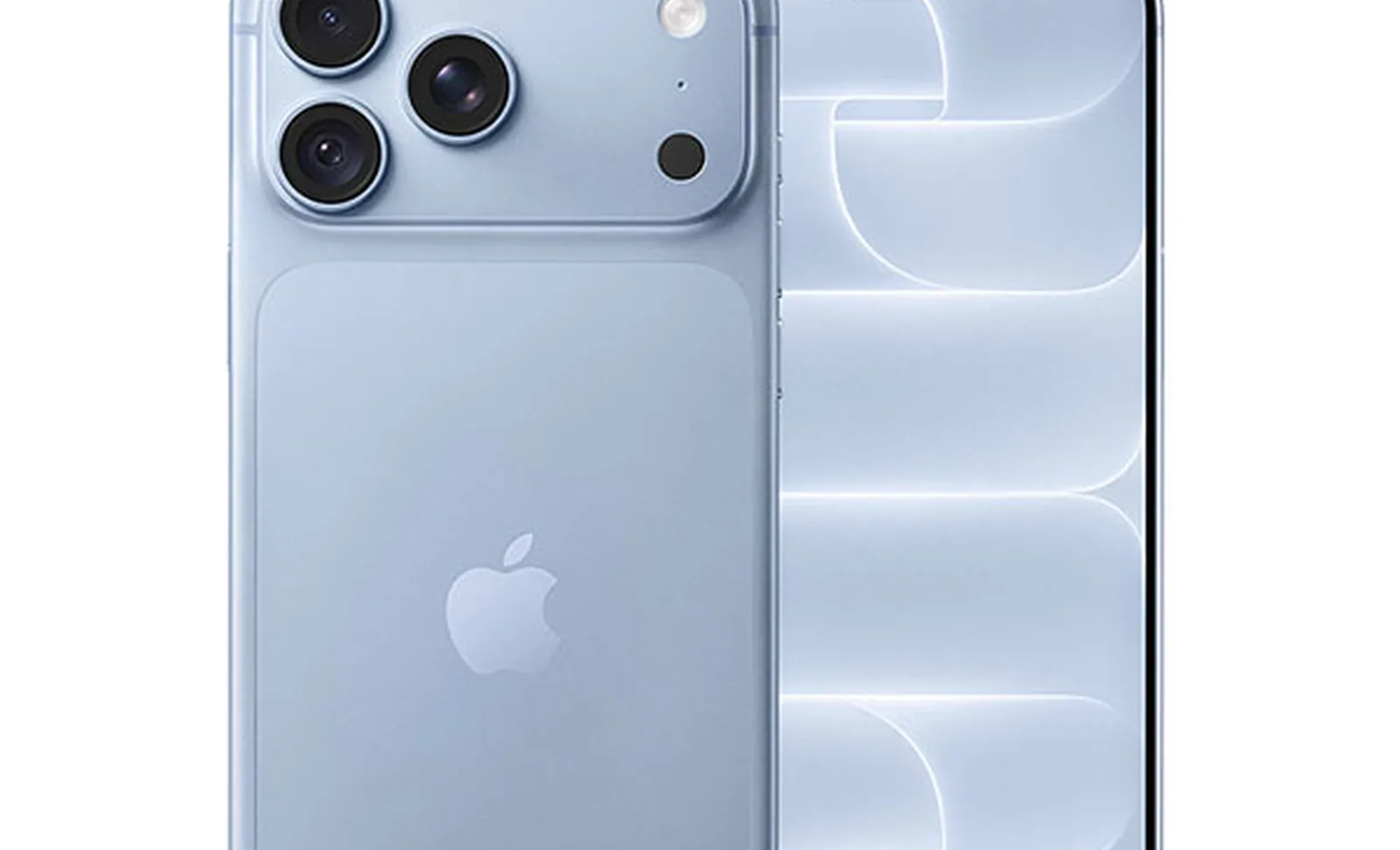
1. Make the Pro Tier Feel Like a Clear Brand Promise
People ask what Apple iPhone Pro is because they want the difference explained in human language. Pro should map to outcomes: who it is for, what feels better, and why the step up matters. Spec sheets alone rarely settle that question.
Audit your own premium tier. If the name sounds exclusive but the website copy still lists the same benefits as the base offer, the brand promise is muddy. Rewrite the first screen so a stranger can repeat the Pro difference out loud. Keep proof nearby: materials, process, or experience cues that match the claim.
Practical move
Write one sentence that starts with "Pro is for…" and one sentence that starts with "Choose base if…". Put both near the comparison module on your website design.
2. Treat Color and Finish as a Brand System, Not Decoration
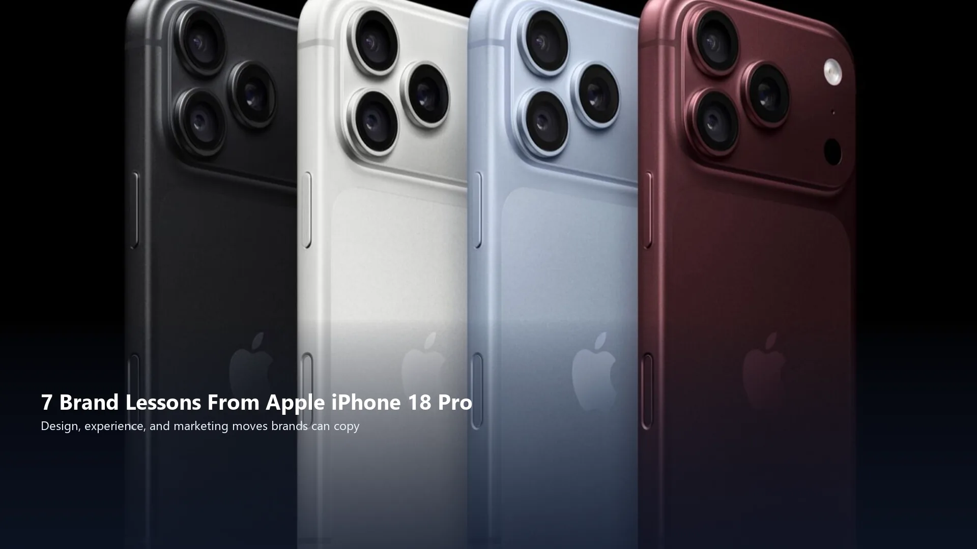
Launch coverage of Apple iPhone 18 Pro often centers color lineups and finish stories because finish is how memory forms. Color systems also answer search curiosity about Product Red and seasonal editions: people notice when color carries meaning.
Build a restrained palette for packaging, product pages, and social frames. Document which finishes appear in hero art versus detail crops. Consistency across surfaces makes the product feel intentional. Random color swaps every week train audiences to ignore you.
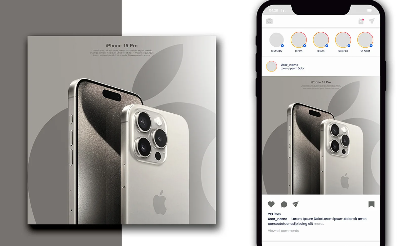
3. Design the Upgrade Story Before the Launch Day Post
People Also Ask interest in the Apple iPhone Upgrade Program is a reminder that ownership is a journey. Brands that only celebrate launch day leave buyers alone with timing, trade-in, and value questions.
Create a simple upgrade narrative: what changed, who benefits, what stays familiar, and what to do next. Publish that story on the site first, then compress it into social. Soft offers belong after clarity. Never invent savings claims or guarantee outcomes.
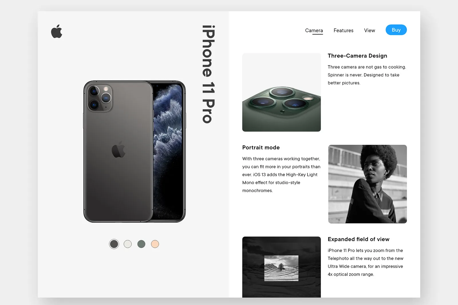
4. Align Website UX With the Product Hierarchy People Search
Related searches for Apple iPhone 18 Pro review and prior Pro Max models show comparison intent. Your IA should answer that intent: side-by-side modules, plain-language diffs, and sticky next steps. Hide nothing important behind tabs that mobile users never open.
Experience design also means performance and readability. Fast pages, readable type, and honest imagery reduce bounce during high-intent spikes. Support drafting with AI content workflows, then edit for accuracy so you never invent specs or testimonials.
Practical move
Add a three-row comparison: who it is for, signature experience, and best next step. Keep the Pro row visually distinct without shouting.
5. Build Social Creative That Explains Pro Without Jargon
Feed creative fails when it assumes everyone already knows the hierarchy. Lead with the human difference: camera feel, finish, size, or workflow. Then offer a path to the deeper review or comparison page.
Operators who rely on social media systems usually win because templates keep Pro messaging consistent across carousels, shorts, and static posts. A system also speeds production when search interest rises suddenly and you need coherent creative fast.
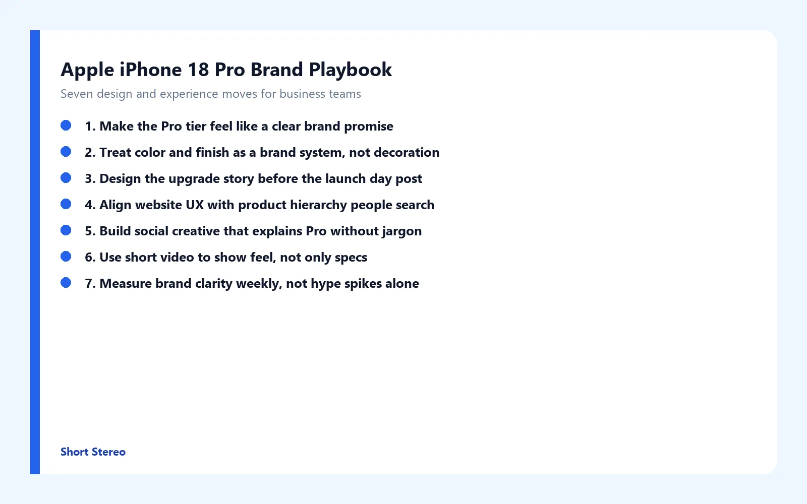
6. Use Short Video to Show Feel, Not Only Specs
Specs travel poorly in a silent scroll. Short video can show grip, finish under light, camera framing, or the workflow that makes Pro feel different. Open on the sensation or outcome in the first second. Keep branding visible. End with a clear next step to a comparison page or contact path.
Repurpose one strong demo into a Reel, a static tip, and a longer caption post. Video amplifies a clear offer. Without a coherent destination, even strong clips leak attention.
7. Measure Brand Clarity Weekly, Not Hype Spikes Alone
Track whether people understand the Pro promise: comparison-page engagement, time on hierarchy modules, social saves on explainer posts, and inbound questions that sound less confused. A spike in Apple iPhone 18 Pro curiosity is a reminder that attention without clarity is expensive.
Review one metric tied to understanding each week. If traffic rises while comparison completion stays flat, tighten language and visuals. If messages rise while the site under-explains tiers, fix UX next. Never promise rankings, sales, or conversions from these moves.
How Short Stereo Helps Brands Apply Launch Lessons
After teams study Apple iPhone 18 Pro search demand, the ones that improve usually fix hierarchy language, website UX, and creative systems together. Short Stereo helps connect those pieces so product attention becomes easier to understand and easier to act on.
Conclusion
Apple iPhone 18 Pro is a branding and experience design case study wrapped in a technology trend: clear Pro promises, intentional color systems, honest upgrade stories, search-aligned website UX, jargon-free social creative, feel-first video, and weekly clarity metrics. None of these moves guarantee sales, rankings, or conversions. They improve the conditions under which people can trust your premium offer. If you want help turning that playbook into design and content execution, visit shortstereo.com.
Frequently Asked Questions
What is Apple iPhone Pro?
Apple iPhone Pro is the higher-tier line positioned for people who want stronger cameras, materials, and performance cues than the standard models. For brands, Pro means a clear promise: what customers get when they choose the premium option. Your website and social creative should make that promise obvious in seconds.
What is Apple iPhone Pro Max?
iPhone Pro Max is typically the largest Pro model, framed for people who want more screen and a more immersive media experience. The brand lesson is hierarchy. Name tiers by outcome, not only specs, so shoppers can self-select. Apply the same clarity to your product pages and comparison modules.
What is the Apple iPhone Upgrade Program?
The Apple iPhone Upgrade Program is Apple's way of packaging ongoing ownership into a simpler renewal story. Brands can learn to design upgrade paths with plain language, clear timing, and visible next steps on the website. Soft promotion belongs after you explain the customer benefit, never before.
What is Apple iPhone 17 Pro Max?
Searchers often compare recent Pro Max generations when they see a new cycle like Apple iPhone 18 Pro. Use that intent to publish honest comparison content that helps decisions without inventing specs. A clear comparison layout on your site builds trust and reduces support friction.
What is the iPhone Product Red?
Product Red is Apple's long-running color and cause partnership story. The branding takeaway is that color can carry meaning when it is consistent across packaging, product pages, and social posts. Businesses can build similar systems with restrained palettes and clear messaging instead of random seasonal swaps.