A home design trend list from ELLE Decor is quietly one of the best early-warning systems in branding.
ELLE Decor just published its list of the six fall 2026 interior design trends defining the season, the palettes, textures, and materials designers can't stop talking about. It reads like a home-decor story, but for anyone building a brand, it's closer to a forecast.
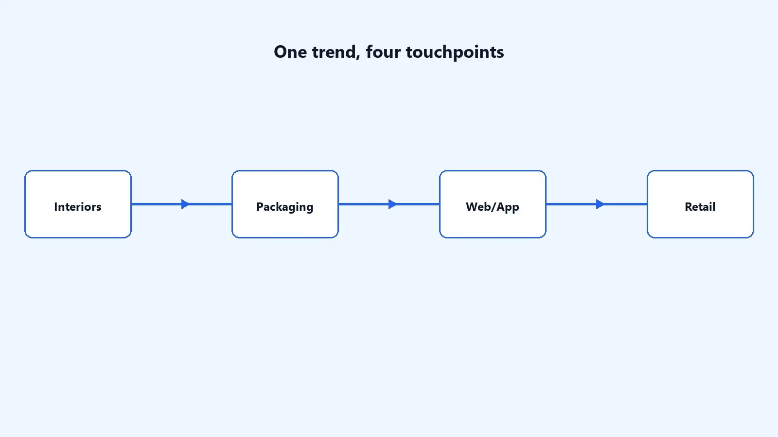
Interior trends move faster into branding, packaging, and web design than most marketers assume. The colors and materials showing up in interiors this season are the same ones that will start showing up in packaging redesigns, website palettes, and retail spaces within the next 12 to 18 months. Brands that spot the shift early get to define the category look; brands that wait end up copying it.
Short Stereo tracks exactly these kinds of cross-industry design signals as part of building brand systems that stay relevant longer, which is why this trend list deserves more than a passing scroll.
The News: ELLE Decor's 6 Fall 2026 Interior Trends
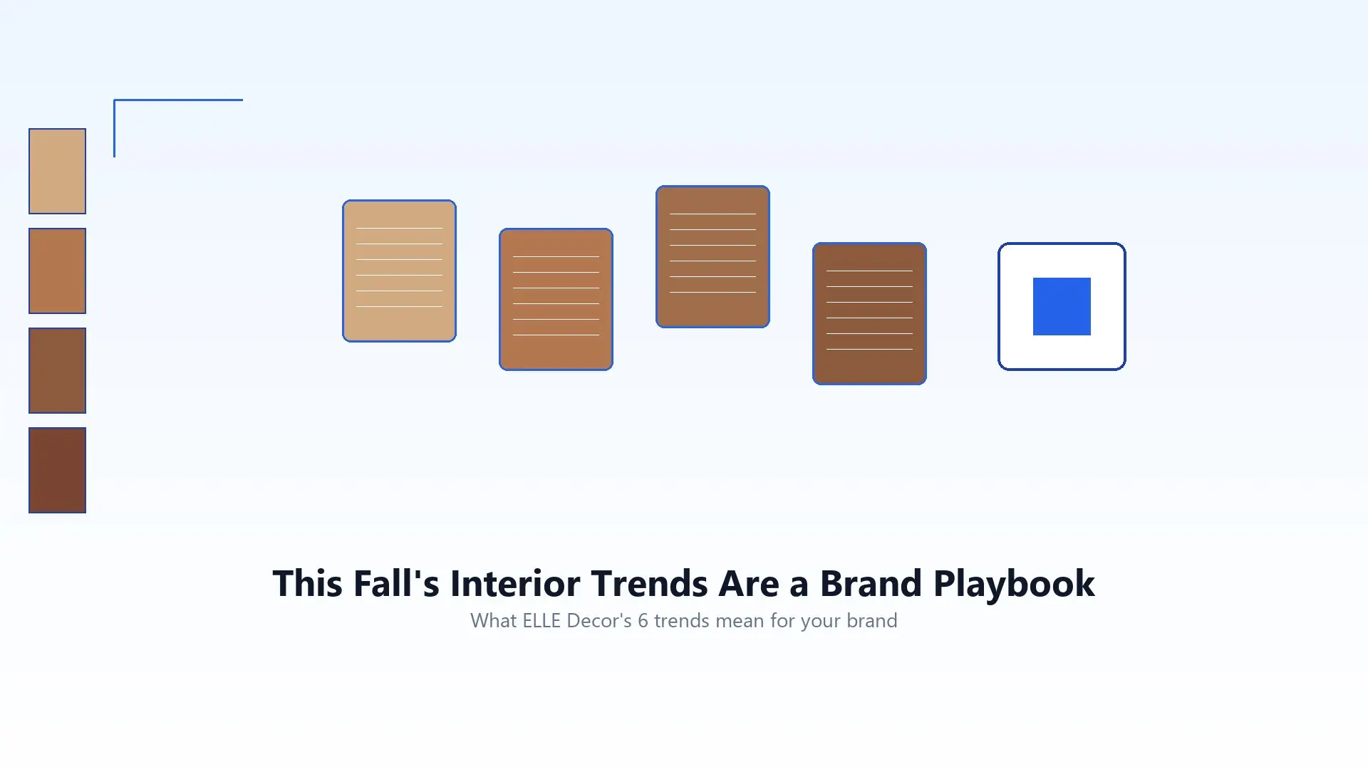
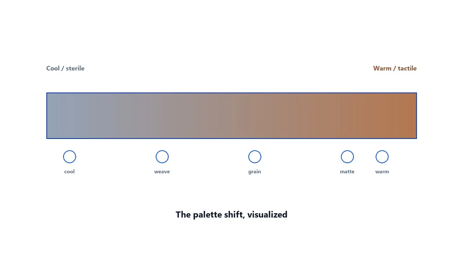
ELLE Decor's roundup covers dark wood revival, hospitality-inspired entrances, wellness spaces, reflective surfaces, material tension, and a lived-in look that favors patina over perfection. The through-line is clear: warmer, more tactile, more personal design is replacing cool, blank-slate minimalism.
That matters for brands because the same cultural mood usually shows up next in packaging, product photography, and digital interfaces. Reading fall 2026 interior design trends as a branding forecast is how you get ahead of the copycats.
Why Interior Design Trends Are a Leading Indicator for Brand Design
Interior design, fashion, and branding all draw from the same cultural mood at slightly different speeds. Interiors tend to move first because they're driven by material and manufacturing cycles that start well before a trend becomes visible in stores or on screens. That makes fall 2026's list less of a decorating guide and more of a preview.
What's Actually Trending This Fall, and What It Signals
Warmer, more tactile color palettes
The clearest thread across this year's list is a move away from cool, sterile minimalism toward warmer, more tactile tones. For brands, that's a signal that the “clean tech minimalism” look many companies leaned on for the last several years is starting to feel dated.
A return to texture and craft over gloss
Alongside warmer color, texture is doing more work, woven materials, matte finishes, visible craft. Translated to brand design, this favors packaging and interfaces that feel considered and tactile rather than purely slick.
The Consumer Experience Shift Brands Should Expect
When interior trends like these mature into consumer expectations, brands typically see a shift in what “feels current” across every touchpoint:
- Packaging that favors texture and matte finishes over glossy, ultra-clean surfaces
- Website palettes shifting from cool blues and greys toward warmer, richer tones
- Photography and video styling favoring natural light and tactile materials
- Retail and event design leaning into craft-driven details over sterile minimalism
None of this means abandoning a brand's core identity, it means refreshing the execution of that identity in a way that doesn't read as stuck in an earlier era.
7 Brand Design Lessons From Fall 2026's Interior Trends
Lesson 1: Color palettes are a brand decision, not a seasonal refresh
Treat palette shifts as strategic, not decorative, they affect perceived trust and modernity.
Lesson 2: Texture builds trust faster than gloss
A tactile, considered look now reads as more credible than an ultra-polished one.
Lesson 3: Warmth is replacing sterile minimalism
The “all-white, all-blue SaaS” aesthetic many brands adopted is losing ground to warmer, more human palettes.
Lesson 4: Material honesty over polish
Showing real texture and material choice, rather than smoothing everything into gloss, is becoming a differentiator.
Lesson 5: Trends move from interiors to packaging faster than expected
The 12 to 18 month lag from interiors to consumer packaging is shrinking; brands that wait for “proof” often move too late.
Lesson 6: Consistency across physical and digital touchpoints matters more
A warm, tactile package paired with a cold, generic website creates a jarring brand experience.
Lesson 7: Being early to a palette shift is a competitive advantage
Category leadership often comes down to who defines a look first, not who executes it best afterward.
Most brands testing a palette or material shift start with their website, since it's the fastest touchpoint to update and the easiest to test against real customer response. Short Stereo's brand-led website experiences are built around exactly this kind of iterative, trend-aware rebuild.
What Brands Should Implement This Quarter
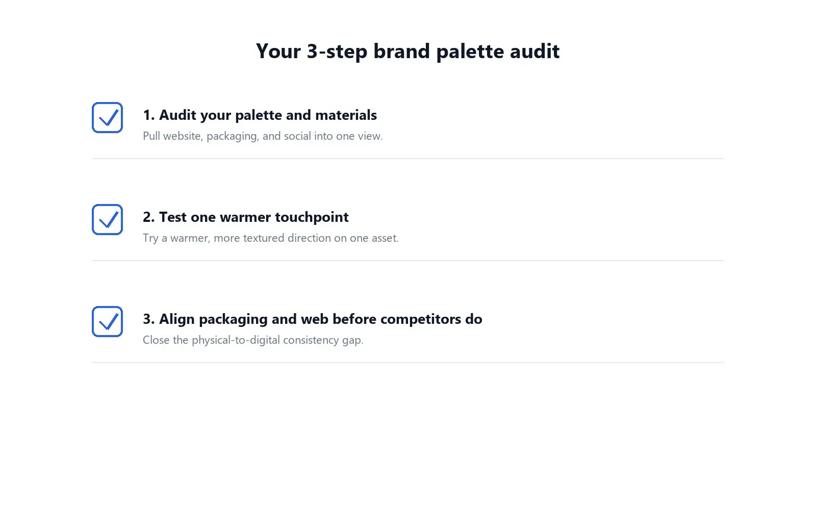
You don't need a full rebrand to respond to this. Start with three moves:
- Audit your current color and material language. Pull your website, packaging, and social templates into one place and check whether they still feel current against this season's shift.
- Test one warmer, more tactile touchpoint. Pick a single asset, an email header, a packaging insert, a landing page, and test a warmer, more textured direction against your current baseline.
- Align packaging and web palette before your competitors do. If your physical and digital touchpoints already feel mismatched, this is the moment to close that gap.
Consistency matters just as much across content as it does across a single asset, a warmer palette on packaging falls flat if your social presence still looks cold and generic. This is where social content systems built for brand consistency tend to make the visible difference fastest. Pair that with AI-assisted content and growth workflows so the system scales without drifting.
Where Most Brands Get This Wrong
The most common mistake is treating design trend lists like this one as irrelevant to branding because they're framed around homes, not products. In practice, interior trends are one of the most reliable early signals available, free research most brands simply aren't reading. Waiting for the trend to show up in a competitor's rebrand means you're responding to a shift, not leading one.
How Short Stereo Helps Brands Apply Fall 2026 Interior Design Trends
Short Stereo turns trend signals into working systems: brand identity, websites, motion, and content that feel current without chasing every fad. If your brand is ready to move on this shift early, start with Short Stereo's design and motion work, then pressure-test the experience across site, social, and packaging.
Conclusion: Fall 2026 Interior Design Trends Are a Brand Design Preview
ELLE Decor's list of fall 2026's interior trends looks, at first glance, like a home-decor story, but the warmer palettes and tactile materials it highlights are a preview of where brand design is headed next. Brands that treat this as a strategic signal, auditing their own color and material language now, will define the next look in their category. Brands that wait will spend next year catching up to whoever moved first. If you're ready to tighten the system, talk to Short Stereo or explore website design built around trend-aware brand systems.
Source note
For original reporting on the six fall 2026 interior design trends (attribution only; no quoted text reproduced), see ELLE Decor.
Frequently Asked Questions
What are the 6 fall 2026 interior design trends ELLE Decor named?
ELLE Decor's fall 2026 list highlights dark wood revival, big hospitality-style entrances, wellness-focused spaces, reflective surfaces, material tension, and a lived-in look with patina and craft, a warmer, more tactile shift designers are already discussing.
Why do interior design trends matter for brand design?
Interior trends tend to move ahead of branding and packaging by roughly 12 to 18 months, making them a useful early signal for where color, material, and texture choices in consumer brands are headed next.
How fast do interior trends usually reach branding and packaging?
Historically the lag has been over a year, but that gap is shrinking. Brands that wait for a trend to fully mature before responding are increasingly moving too late to lead their category.
Is this relevant for digital-only brands, not just physical products?
Yes. Website palettes, photography styling, and interface texture (shadows, gradients, imagery) all respond to the same cultural shift, even for brands with no physical packaging at all.