Mashed just ranked America's best whiskey brands. Brand leaders should read it as a packaging case study, not a tasting note. Shoppers still type Jack Daniel's branding, Maker's Mark, and whiskey label design when they want to know why certain bottles win before the first sip. The lesson is how bottle design, label typography, and story turn into lasting shelf fame.
Mashed asked Peck Slip Social owners Alex Davis and Learan Kahanov to help pick nine American whiskeys, from Jack Daniel's Old No. 7 to Buffalo Trace, Maker's Mark, and Woodford Reserve. Quality, they caution, is personal. Design is not. Famous bottles share locked silhouettes, readable type, and heritage cues customers can find in one second.

Coverage of "The 9 Best American Whiskey Brands" is the source list. Read the Mashed ranking of America's best whiskey brands for drinkability notes. This article extracts the packaging lessons: how Jack Daniel's branding, Maker's Mark wax, Buffalo Trace heritage, and Woodford Reserve's landmark story still work when a shopper is in a hurry.
Why Jack Daniel's Branding Matters to Searchers
People search Jack Daniel's branding because the bottle is already a cultural object. Mashed calls it the most familiar name for drinkers who do not live in whiskey forums. Old No. 7 is a global bestseller, a bar-standard mixer, and often a first pour. When a package becomes that common, founders and CMOs want the system behind the fame, not another tasting wheel.
Brand leaders want a portable rule for packaging design: what must a label, bottle shape, and heritage line do so a customer can find you and still trust you after they pick you up. Famous entities create demand. Your job is to convert that demand into branding strategy on your own pages.
That is why whiskey branding belongs in a brand brief even if you do not distill. Any business shipping physical goods, gift boxes, or ecommerce grids faces the same trap: a distinctive object that outruns a weak story, or a rich story that never becomes a recognizable object on the shelf.
What Changes for Consumer Experience
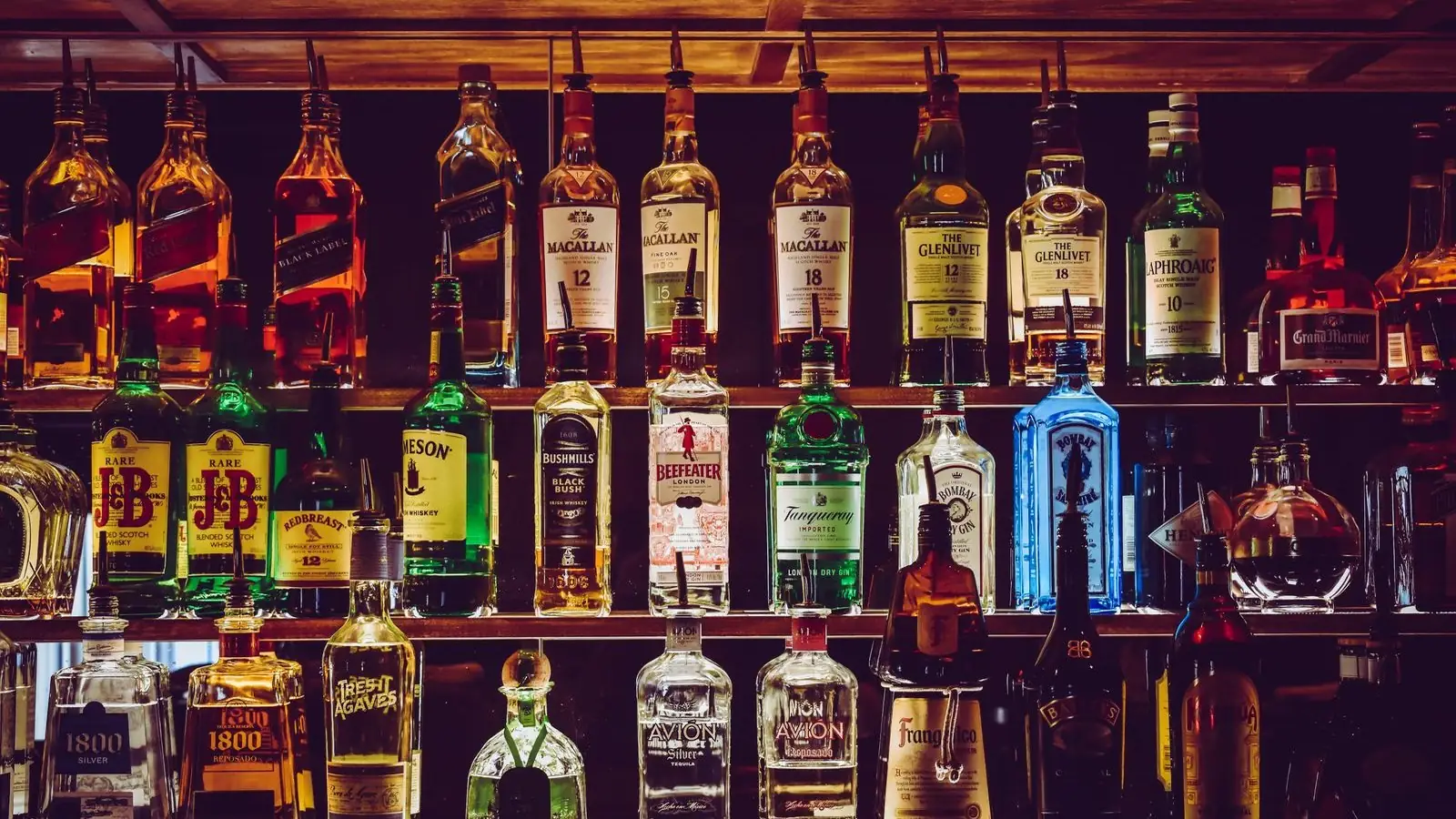
Consumers do not walk into a liquor store asking for mash bills. They scan shapes, wax, black labels, and type. Jack Daniel's familiarity, Maker's Mark's scarlet seal, Buffalo Trace's heritage cues, and Woodford Reserve's distillery story all compress a purchase into a glance. Experience design must assume customers arrive with slogan-level memory and need proof before they trust the price.
Confusion appears when the bottle says two centuries and the homepage says limited drop of the week. That mismatch feels like bait even when the liquid is real. A coherent website design system and disciplined social media branding should keep the hero object, the heritage sentence, and the proof in the same family.
Trust is the consumer experience change that matters. Shoppers forgive a simple package. They punish a package that cannot survive a follow-up look on the product page or a photo on a bar back.

Brand and Visual System Implications of Whiskey Labels
Whiskey label design is a visual system problem as much as a copy problem. The bottle appears on shelves, bar walls, gift sets, and homepage heroes. Once a silhouette becomes famous, every surface must answer: what is this brand in one second, and what proof sits next to the romance?
Brand systems should prepare for three pressures. Distinctive cues, wax, square labels, long necks, black lockups, must stay consistent. Digital brand identity needs a packaging glossary so campaigns do not invent a new bottle myth every quarter. Branding strategy here is clarity under fame, not more adjectives on a tasting note.
Jack Daniel's did not invent mixed drinks, but the locked Old No. 7 system taught the market which bottle to memorize. Maker's Mark taught which seal to photograph. Buffalo Trace taught which heritage line to trust at an approachable price. Woodford Reserve taught which landmark story to attach to a cocktail pour. Design the definition early or competitors will own the glance for you.
Visual systems should also resist logo theater. Do not plaster competitor bottles to borrow authority. Build your own cue hierarchy so customers can verify claims without leaving the page.
7 Brand Lessons From Jack Daniel's and Maker's Mark
1. Familiarity is a designed system, not luck
Mashed says Jack Daniel's may be the most familiar name on the shelf, a first whiskey for house parties, and one of the most valuable spirit brands in the world. That is distribution plus a bottle people can identify from across the room. If your category already has a default object, match its calm or differentiate with one cue that is equally findable.
2. One ritual package cue beats a paragraph of copy
The scarlet-red wax seal and long-necked bottle of Maker's Mark are a common sight on liquor shelves and bar backs. Mashed notes that the look is part of the quality association. Brand teams should pick one physical ritual, a seal, stamp, neck, or closure, that photographs, shelves, and stories can share.
3. Heritage only counts when the package can carry it
Buffalo Trace leans on more than 200 years of distillery operation and a world's-most-awarded claim, then still has to look like a bottle you would pick at an approachable price. Write a heritage sentence the label, box, and website can actually hold. Empty "since whenever" lines without a visual system read as costume.
4. Landmark stories need architecture, not a brochure dump
Woodford Reserve's Kentucky distillery is a historic landmark in Versailles, and the brand fans flavor versions across a deep lineup. Landmark claims need photography, type, and page architecture that match the bottle. A PDF dump of history is not a brand system.
5. Eyes buy first, tasting notes buy second
Shoppers choose with silhouette, color, and type before they choose with mash bills. Typography, bottle shape, and color blocking are brand equity. Taste notes are the second conversation, useful on the page, useless if the shelf scan fails.
6. Align bottle, website, and social or the story splits
If the wax is the hero in retail and the homepage leads with a different metaphor, customers assume a rebrand. Keep one cue family across website, social, and packaging. Scale that education with AI content workflows that stay on the approved heritage sentence instead of inventing a new origin myth every campaign.
7. Assign one owner who can reject novelty redesigns
Marketing loves seasonal skins. Packaging equity dies when every campaign invents a new bottle. Give one owner veto power over cues that cannot survive a bar photo or a customer support ticket. That owner protects brand trust more than another limited-edition brainstorm.

What Businesses Should Implement This Week
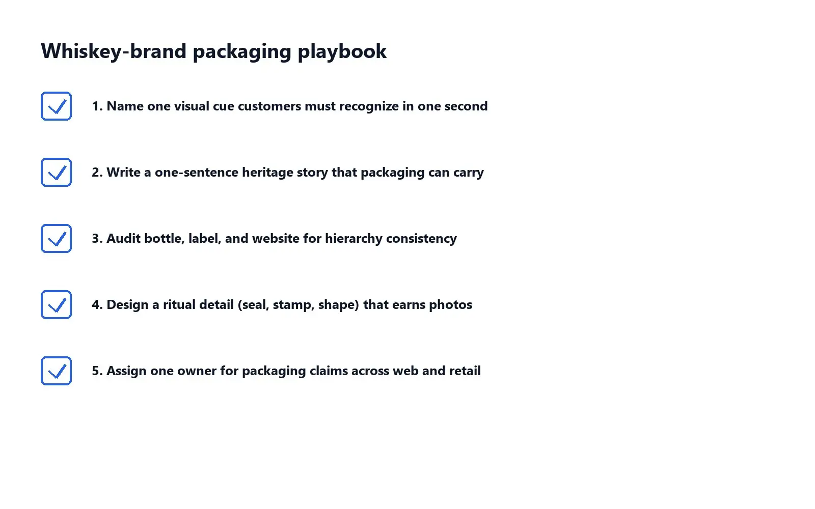
- Name one visual cue customers must recognize in one second, then protect it on every SKU.
- Write a one-sentence heritage story that the bottle, box, and website can actually carry.
- Audit bottle, label, and homepage hierarchy for conflicts in type, color, and claims.
- Design a ritual detail (seal, stamp, shape, or closure) that earns photos without extra copy.
- Publish an internal packaging sheet for web, social, retail, and support.
- Assign one owner who can reject novelty redesigns that fail a shelf-trust test.
Consistency during a heritage trend matters more than inventing a flashier bottle. Customers forgive a calm, clear system. They punish confused promises. Use Mashed's whiskey coverage as a forcing function to tighten your own packaging language before the next campaign ships. Craft names on the same list can open a conversation. They cannot replace a silhouette people already know.

How Short Stereo Helps Brands Build Heritage Packaging Systems
Short Stereo helps teams turn famous packaging cues into practical identity systems: clearer websites, on-brand social, and AI-assisted content that does not invent claims. After lists like Mashed's whiskey ranking, the brands that win are the ones that can keep one bottle story intact across labels, product pages, and campaigns.
Conclusion
Jack Daniel's branding matters because the bottle is one of the most searched, most photographed, most default pours in American spirits. Maker's Mark wax made ritual visible. Buffalo Trace and Woodford Reserve show how heritage and landmarks still sell when the package can carry them. The seven lessons above help any business build packaging that lasts. Close those gaps now, while you can still design the system instead of reacting under launch pressure. If you want help turning that into a practical brand and website system, visit shortstereo.com.
Frequently Asked Questions
What makes Jack Daniel's branding so recognizable?
Jack Daniel's branding is recognizable because the Old No. 7 bottle, square label, black-and-white lockup, and bar-standard availability trained generations of drinkers to find it in one glance. Mashed notes it is often the first whiskey people meet. That familiarity is a designed system, not an accident.
Why does Maker's Mark packaging matter for brand teams?
Maker's Mark packaging matters because the scarlet wax seal and long-necked bottle do recognition work before anyone tastes the pour. Mashed flags the look as part of the quality association. Brand teams should study one ritual cue that photographs, shelves, and stories can carry together.
What branding lessons can non-distillery brands steal from whiskey labels?
Non-distillery brands can steal a locked silhouette, a one-second shelf cue, a heritage sentence the package can actually carry, aligned website and social language, and an owner who protects those cues from novelty redesigns.
Which American whiskey brands did Mashed highlight for design and fame?
Mashed's 2026 list of nine American whiskey brands includes Jack Daniel's, Buffalo Trace, Maker's Mark, Woodford Reserve, Stranahan's, Knob Creek, Widow Jane, Great Jones, and WhistlePig, with expert notes from Peck Slip Social's Alex Davis and Learan Kahanov.