AI safety isn't only a policy problem. Increasingly, it's a design problem, and the decisions are hiding in plain sight.
A recent UX design perspective on improving AI safety makes a point that's easy to miss: the biggest safety wins in AI products rarely come from a new policy document. They come from design decisions, a pause before a message sends, a plainly worded limit, a tone that de-escalates instead of deflects. ChatGPT safety design is the product most people have actually used, so it's the clearest place to see this play out. This piece breaks down what ChatGPT and other AI chatbots get right about safety UX design, what founders and design leads should learn from it, and seven concrete decisions worth stealing for any product introducing AI to its users.

Short Stereo has spent years designing digital products and content for brands introducing new, unfamiliar experiences to their customers, AI-powered ones included. Explore website design services if you're weighing where to start.
Why AI Safety Is Suddenly a Design Conversation, Not Just a Policy One
For a long time, “AI safety” sounded like something that lived in a policy team's slide deck, model training, content filters, legal review. That's changing. As more everyday products add a chat interface or an AI feature, the safety of that experience increasingly comes down to interface design: what the product shows, when it pauses, and how it says no.
This matters because founders, CMOs, and design leads are now the ones making these calls, often without a background in AI safety. A UX design perspective on the issue argues that treating safety as a design discipline, not just a backend policy, leads to products people trust enough to actually use. Among current UX design trends, AI safety explained through the interface is one of the sharpest shifts teams face.
What ChatGPT Gets Right About AI Safety UX Design
The Consumer Experience Has Already Changed
Most people's first real interaction with an AI system is a chat window like ChatGPT's, plain, conversational, and fast. That simplicity is exactly why the design choices around it carry so much weight. There's no menu of settings to hide behind; the safety of the experience has to live inside the conversation itself.
ChatGPT and similar tools have popularized a few now-familiar patterns: a brief pause before sensitive responses, plain-language notices about limitations, and clear off-ramps to human help on serious topics. None of these require the user to read a policy page. They're explained in the moment, through design.

7 UX Decisions Behind Every Safe AI Chatbot
Here's the practical part. These are seven design decisions worth applying to any product that talks back to its users.
1. The Confirmation Pause
A brief pause or “checking” state before a sensitive response signals that something thoughtful is happening, not just a fast autocomplete. It's a small delay that buys real trust.
2. Visible Uncertainty
Good AI chatbot UX admits what it doesn't know, in plain language, rather than answering everything with the same confident tone. Uncertainty shown honestly is more trustworthy than false confidence.
3. Escalation to a Human, Not a Dead End
When a topic goes beyond what the product should handle alone, the best experiences hand off clearly, a link, a contact, a next step, instead of just refusing and stopping.
4. Content Warnings That Don't Interrupt Trust
A warning can be clear without feeling like an accusation. The best versions are short, specific, and get out of the way once acknowledged.

5. Clear Limits, Stated Plainly
Telling a user what the product can't do, in the moment it matters, prevents far more frustration than a buried terms-of-service page ever could.
6. Undo and Correction Paths
Letting a user quickly correct or retract a request is a safety feature as much as a convenience one. It turns a mistake into a non-event.
7. Tone That De-Escalates, Not Just Disclaims
The words a product uses when something goes wrong matter as much as the fact that it caught the problem. Calm, specific language does more than a generic disclaimer.
Branding and Experience Design Implications
This isn't only a product-safety story, it's a branding strategy story. How a company designs its AI feature to handle uncertainty, mistakes, or sensitive requests says as much about its digital brand identity as its logo or color palette does.
A brand that handles a hard moment with a calm, clear interface builds more trust than one with a polished visual identity and a confusing chatbot. Experience design and safety design have effectively become the same job, and that shift is worth reflecting in how design teams are briefed and staffed going forward.

Small UX choices, a pause before sending, a plainly stated limit, a calm tone, do more for user trust than a disclaimer ever will. That's the core idea behind good experience design. If you're building an AI feature and want it to feel trustworthy from the first interaction, explore website design services built around exactly this kind of detail.
What Businesses Should Implement This Quarter
Design and Content
Audit any AI or chat feature you have live. Check whether it states its limits plainly and whether uncertain answers are flagged as such, rather than delivered with false confidence.
Social and Video
When talking about AI features publicly, keep the language specific and honest about what the product does and doesn't do. A social media system built around consistent, plain-spoken messaging helps here.
AI Content Systems
Build a lightweight review process for anything your AI feature says to users on sensitive topics, so tone and escalation paths get checked regularly, not just at launch. AI content and growth support can help set this up as an ongoing system.
How Short Stereo Helps Brands Design Safer AI Experiences
Short Stereo helps teams turn AI safety UX design into something practical: clearer product flows, websites that state limits without legal fog, and content systems that keep tone consistent when the technology underneath is still new. ChatGPT safety design patterns are useful reference points, not templates to copy blindly, and the work is adapting them to your brand.
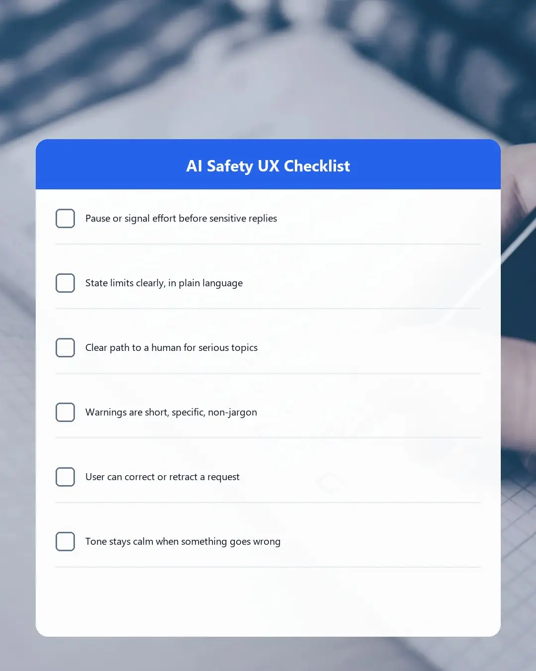
A Simple AI Safety UX Checklist
Use this as a quick gut-check this week:
- Does your AI feature pause or signal effort before sensitive responses?
- Does it clearly state what it can't help with, in plain language?
- Is there a clear path to a human for serious or sensitive topics?
- Are warnings short, specific, and free of legal-sounding jargon?
- Can a user easily correct or retract a request?
- Does the tone stay calm and specific when something goes wrong?

AI safety is no longer just a backend policy question, it's showing up in the small design decisions users experience directly, the way ChatGPT's pauses, warnings, and plain-spoken limits already have. If you're building an AI feature and want it to feel as trustworthy as it is capable, Short Stereo can help you design it that way from the start.
Conclusion
A UX design perspective on AI safety makes a simple but important point: safety isn't only decided in a policy document, it's built into the interface, one small decision at a time. ChatGPT safety design, confirmation pauses, plain-language limits, and calm tone during hard moments, are UX design choices as much as safety ones, and they're worth studying for any brand adding AI to its own product. The seven decisions above are a practical starting point. Treat AI safety as an experience design problem now, and you'll build a product people trust before you're forced to fix one they don't.
Frequently Asked Questions
What does UX have to do with AI safety?
Much of how safe an AI product feels comes down to interface design, how it communicates limits, uncertainty, and handoffs to a human, not just what happens behind the scenes in the model itself.
Is ChatGPT actually safe to use?
ChatGPT includes several UX-level safety patterns, like clear limits and escalation paths on sensitive topics, but safe depends on the specific use case. It's a useful reference point for good AI safety UX design, not a guarantee for every scenario.
What is a "guardrail" in AI design?
A guardrail is a built-in limit or check, in the interface or the underlying system, that keeps an AI product from responding in unsafe, inaccurate, or inappropriate ways.
Do small businesses building with AI need to worry about this?
Yes. Any product with a chat or AI feature makes safety-relevant UX decisions, whether intentionally or not. Applying even a few of the seven decisions above meaningfully improves user trust.
How do I audit my product's AI safety UX?
Start with the checklist in this article: check how your product states its limits, handles uncertainty, escalates to a human, and recovers from mistakes, then walk through a few real conversations to see how it holds up.